Card3n: What if
the band was
the magazine?
Card3n started with a completely different idea.
Instead of approaching the website like a typical band homepage, I kept thinking about music magazines.
Not just the covers, but the experience of opening one.
You’d see the band photos, read interviews, find out what everybody was like, and get a little glimpse into the world behind the music.
That felt like an interesting direction for a band website.
- PROJECT TYPE
- Band Website / Creative Direction
- CREATIVE INSPIRATION
- Alternative Press / Music Magazines / Backstage Culture
01 THE IDEA
MORE THAN A BAND PHOTO AND SOME TOUR DATES.
I wanted visitors to feel like they were getting to know Card3n, not just finding information about them.
One reference kept coming back to me: those old MTV and TRL segments where a band member would take the camera backstage, onto the tour bus, or into the dressing room.
Someone would open a door, the rest of the band would look up, and suddenly you felt like you were hanging out with them.
That feeling became a big part of the concept.
The website needed to communicate two things at once:
This band looks fun to hang out with.
And I want to see them play live.
02 FINDING THE LOOK
THE COVER STORY TREATMENT.
Alternative Press and the music-magazine culture surrounding it gave us a strong visual starting point.
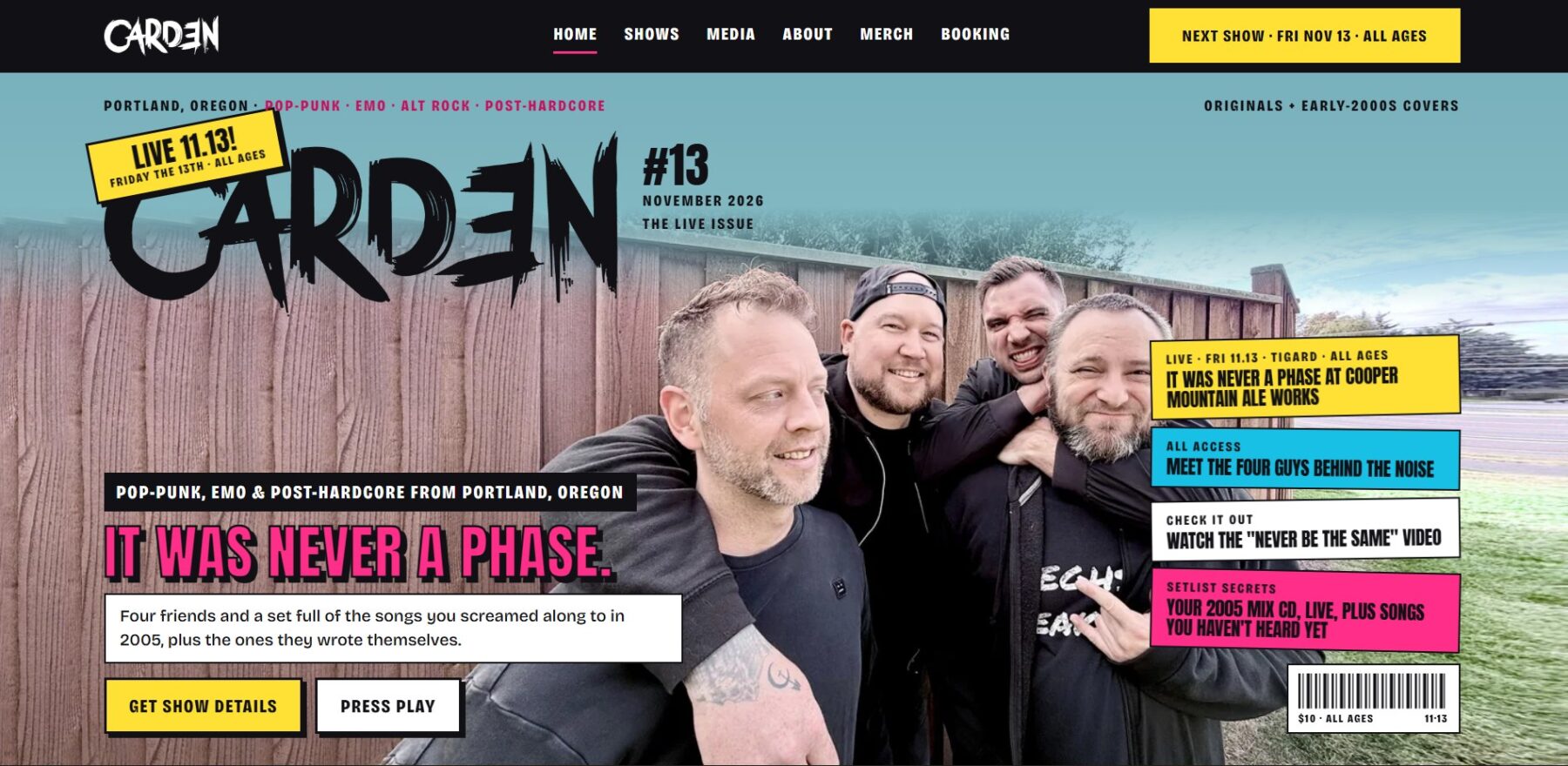
We explored an editorial approach with oversized typography, striking band imagery, member features, and layouts inspired by music journalism.
The homepage became the cover of the magazine.
From there, the rest of the website could feel like exploring different features and stories.
We also had to be careful not to overdo the effect.
A real magazine cover can be incredibly crowded. For the website, I wanted the same excitement with a little more breathing room.
Enough personality to feel authentic.
Enough restraint to actually enjoy using it.
03 BUILDING THE EXPERIENCE
LET THE BAND’S PERSONALITY LEAD.
The magazine concept gave us room to do more than decorate the homepage.
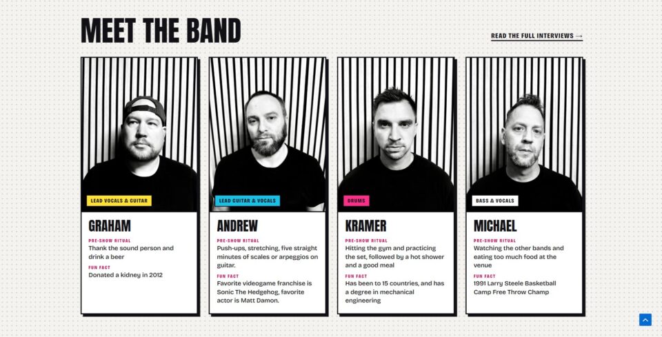
Band-member profiles could feel like editorial features.
Photos and videos could become part of the story.
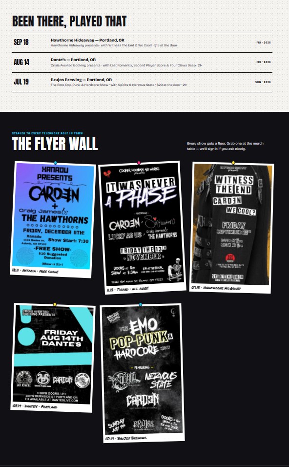
Show information could borrow from the visual culture of concert posters and music publications.
The goal wasn’t to turn every piece of information into a gimmick.
It was to make everything feel like it belonged to the same band.
And unlike a traditional magazine, visitors still needed to navigate it easily, particularly on their phones.
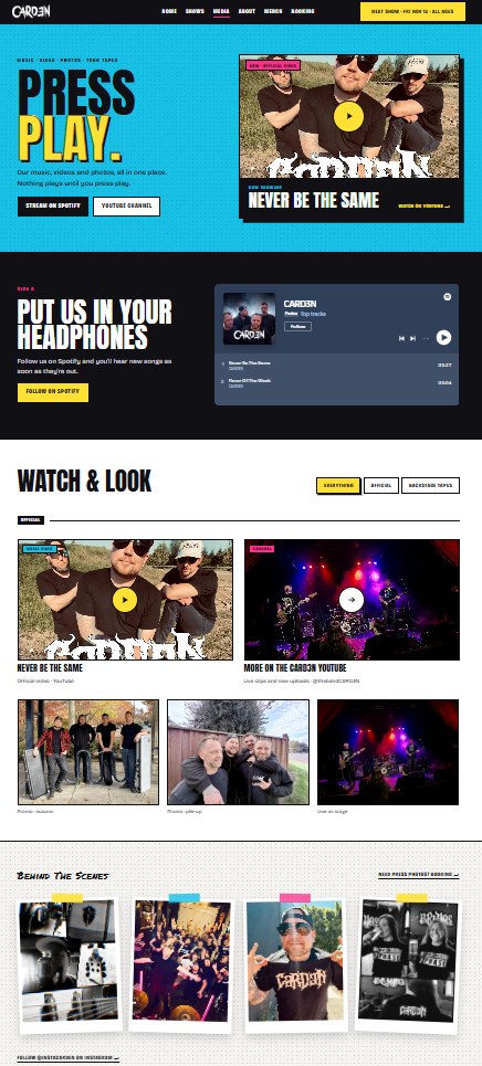
04 THE FINISHED PROJECT
A LITTLE MORE BACKSTAGE. A LOT MORE PERSONALITY.
What I enjoy most about Card3n’s website is that the concept came from thinking about the experience rather than just picking a visual style.
The magazine references helped establish the look, but that backstage feeling shaped the bigger idea.
It’s a website designed to introduce the band, communicate their personality, and give visitors a reason to explore beyond the homepage.
Failure’s Not Flattering was about revisiting a particular moment in music culture.
Card3n was about inviting people into the band’s world.
Two very different starting points.
And that’s what makes projects like these fun.
card3n.com
What’s next?
The next project could be a band, a venue, a studio, or something completely different.