OUR WORK
Every project
starts
somewhere
different.
The music. The people. The references. The story.
I try to understand what makes a project its own thing before deciding what the website should look like.
Here are a couple of projects that show where those conversations can lead.
PROJECT 01 · FAILURE’S NOT FLATTERING
A little
nostalgia.
A lot of
personality.
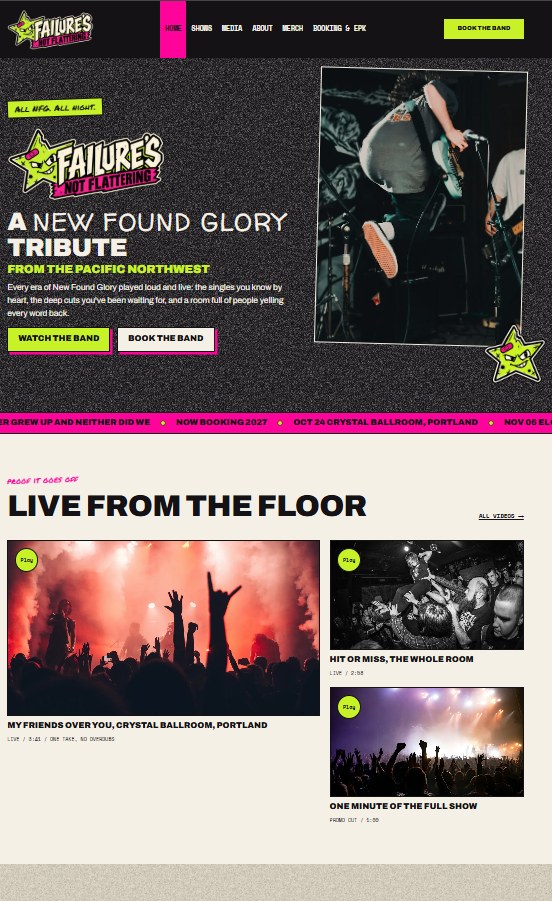
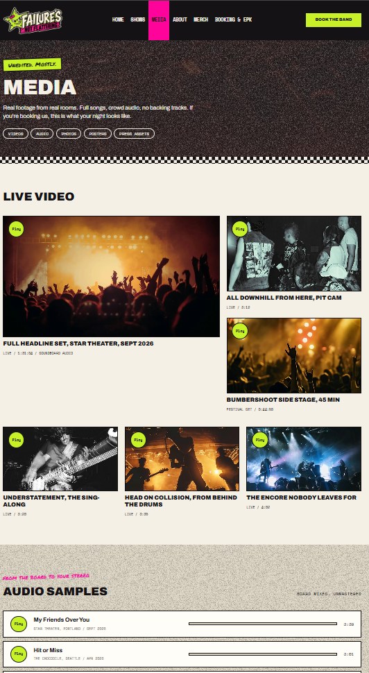
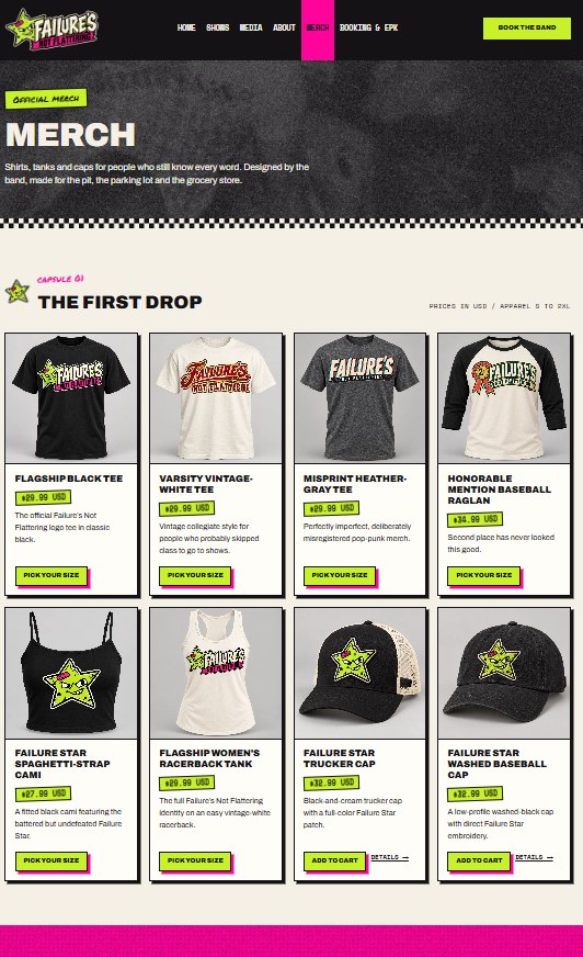
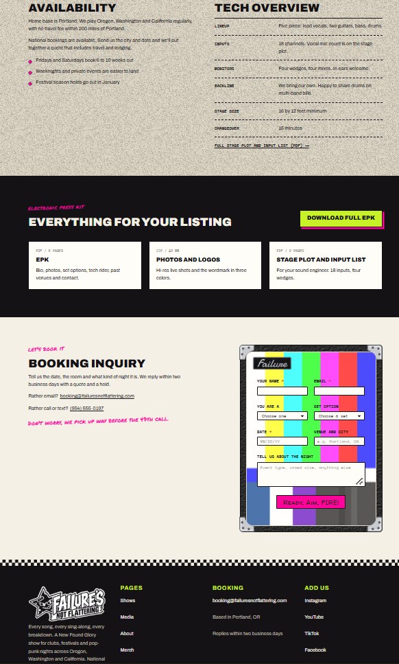
Failure’s Not Flattering is a New Found Glory tribute band.
That gave the website a clear starting point: the music and culture surrounding early-2000s pop-punk.
Bright colors, playful graphics, a star mascot, and the feeling of old show flyers became part of the visual language.
But it still needed to work as a useful band website.
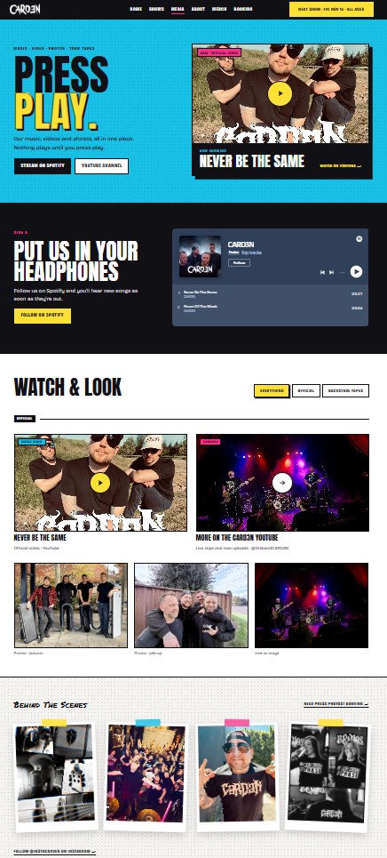
PROJECT 02 · CARD3N
The band
gets the
cover story.
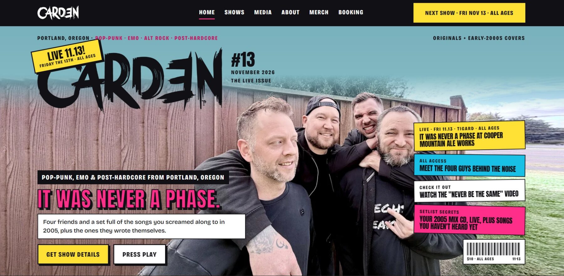
Card3n started with a different idea.
What if visiting the band’s website felt like opening a music magazine devoted entirely to them?
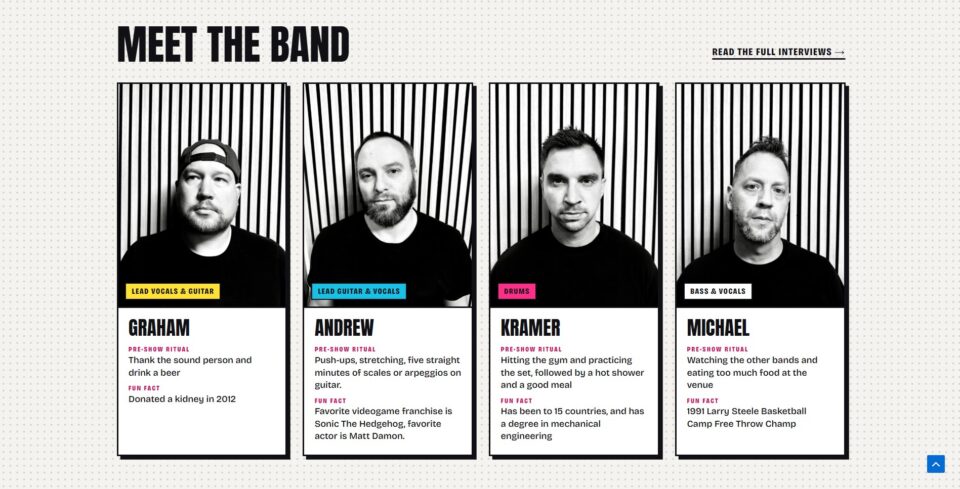
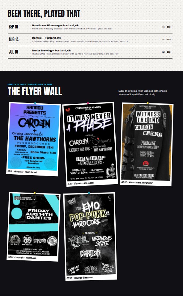
The inspiration came from music magazines, cover stories, backstage features, and the experience of getting to know the people behind the music.
That idea shaped much more than the colors.
It influenced the way the entire website was presented.
What’s next?
The next project could be a band, a venue, a studio, or something completely different.