Failure’s Not Flattering: A website that
remembers the
good old days
Failure’s Not Flattering is a New Found Glory tribute band, and that gave me a pretty specific world to work with.
If you were around for early-2000s pop-punk, you probably remember the oversized band tees, Warped Tour, music magazines, questionable MySpace layouts, and websites that had a whole lot more personality than they probably needed.
That was the atmosphere I wanted to capture.
Not by recreating an old website, but by bringing some of that energy into something that works today.
- PROJECT TYPE
- Band Website / Creative Direction
- CREATIVE INSPIRATION
- Early-2000s Pop-Punk / New Found Glory
01 THE IDEA
WHAT IF THE WEBSITE FELT LIKE PART OF THE SCENE?
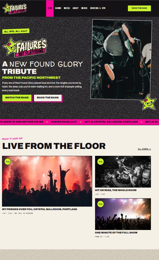
I didn’t want the band to have another standard website with a logo, a photo, and a few dates.
New Found Glory’s music comes from an era with a really recognizable visual culture. It seemed like a missed opportunity not to use it.
We explored artwork inspired by old music magazines, early internet culture, pop-punk merchandise, and the kind of graphics you’d find on a sticker-covered guitar case.
The result needed to be familiar enough to trigger some nostalgia, but original enough to have its own identity.
02 FINDING THE LOOK
A LITTLE MESSY. AND SOMETHING I CALL PERSONALITY.
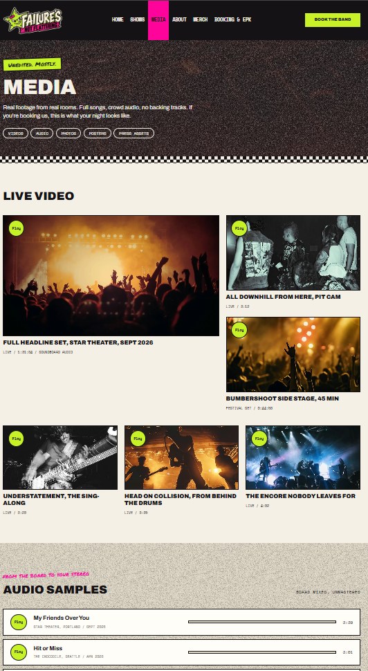
The visual direction took shape around energetic colors, bold lettering, playful graphics, and artwork that didn’t take itself too seriously.
We developed several merchandise concepts, including a star mascot, varsity-inspired graphics, ribbons, alternate wordmarks, and other artwork rooted in the humor and attitude of the era.
Not every idea needed to become part of the website.
But exploring them helped establish the personality of the band beyond a single logo.
That identity carried into the website’s visual presentation.
03 MAKING IT USEFUL
NOSTALGIA IS FUN. GETTING BOOKED MATTERS TOO.
As much as I wanted the site to feel like early-2000s pop-punk, it still needed to work as a band website in the present.
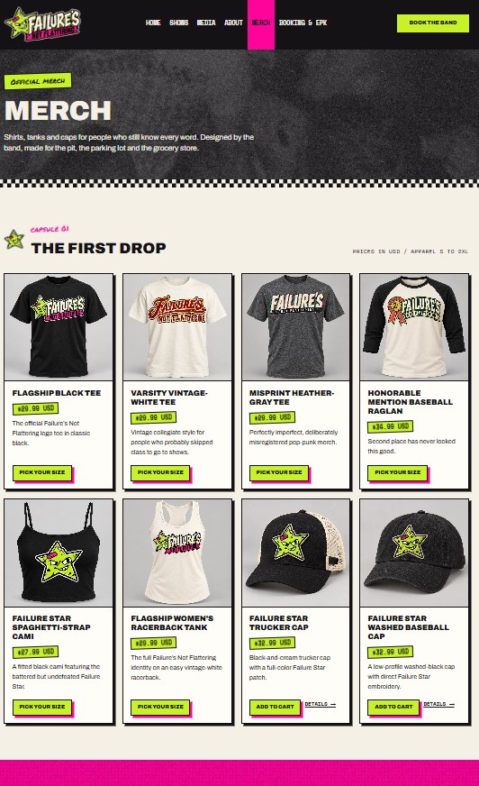
Shows, media, merchandise, and booking information all needed a place.
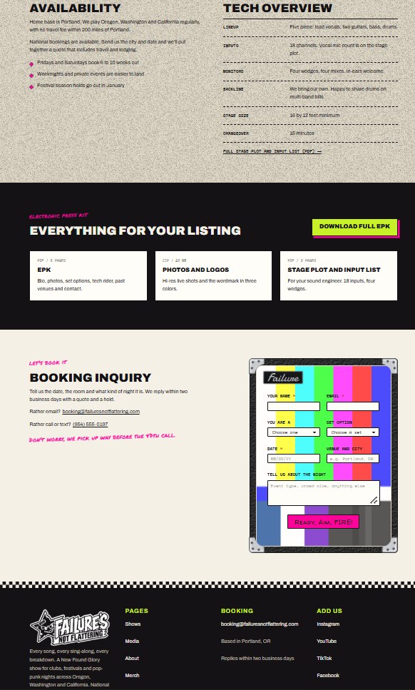
The booking experience and electronic press kit were especially important. A venue or promoter shouldn’t have to dig around to understand who the band is or how to contact them.
The design could have all the character we wanted without making the practical stuff harder.
04 THE FINISHED PROJECT
OLD-SCHOOL ENERGY. A MODERN HOME.
What I like about this project is that the nostalgia isn’t just decoration.
It influences the artwork, the personality, and the way the band presents itself.
The website has its own identity while remaining connected to the music and era that inspired it.
And that’s exactly what I wanted it to do.
failuresnotflattering.com
What’s next?
The next project could be a band, a venue, a studio, or something completely different.